
Visual identity for pantry by livstid, a package-free dry goods grocer celebrating the art of slow living.
my role
BRAND STRATEGY
VISUAL IDENTITY
Collateral Design
digital campaigns

The Challenge
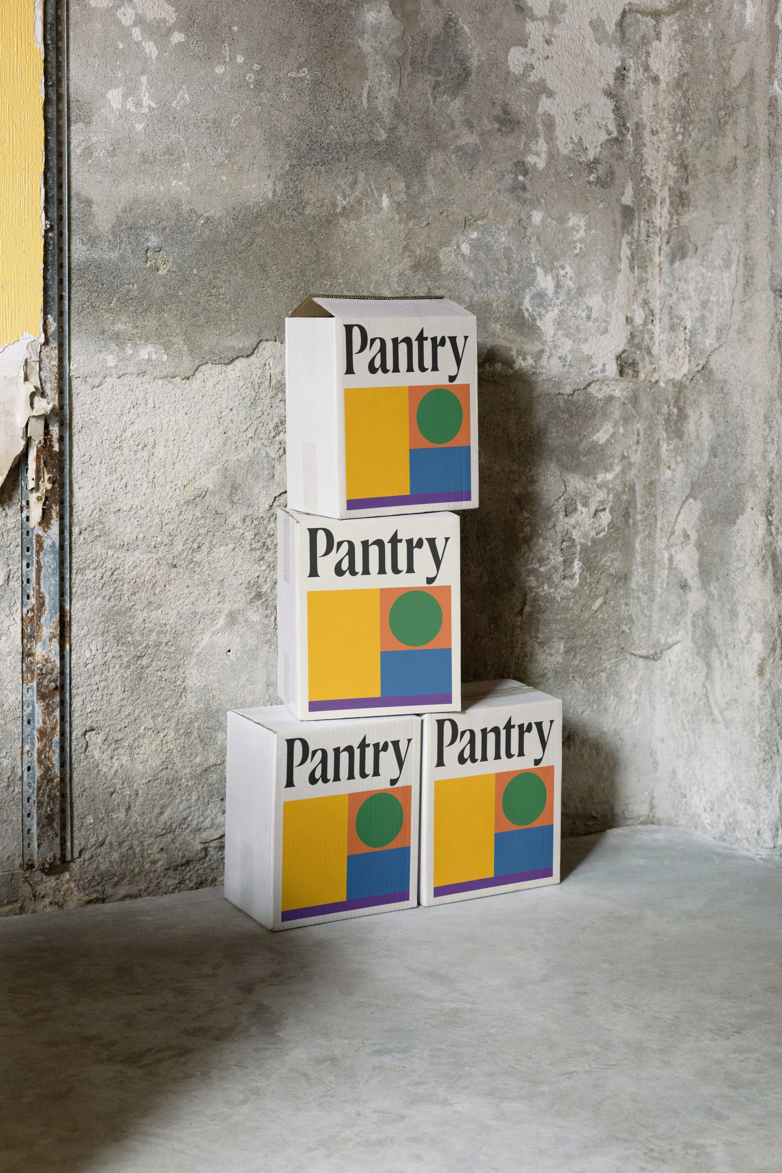
I developed a distinctive visual identity system featuring minimalist geometric shapes inspired by organic forms and culinary elements, creating a visual language that's both contemporary and timeless. A restrained color palette of earthy greens, warm oranges, and sunny yellows connects to natural ingredients while remaining sophisticated. Typography remains clean and understated, allowing the geometric elements to take center stage across applications. The system's flexibility allows for impactful applications across various touchpoints—from reusable packaging to social media—ensuring brand recognition in both physical and digital spaces while maintaining design integrity even with limited production resources.


The Solution
I developed a distinctive visual identity system featuring minimalist geometric shapes inspired by organic forms and culinary elements, creating a visual language that's both contemporary and timeless. A restrained color palette of earthy greens, warm oranges, and sunny yellows connects to natural ingredients while remaining sophisticated. Typography remains clean and understated, allowing the geometric elements to take center stage across applications. The system's flexibility allows for impactful applications across various touchpoints—from reusable packaging to social media—ensuring brand recognition in both physical and digital spaces while maintaining design integrity even with limited production resources.

“The art of slow living”
Our Services
-
Mindful
-
Community
-
Sustainable
-
Artful

Color Palette
The Pantry by Livstid color palette balances earthy neutrals with vibrant accents to create a system that's both grounded and energetic. Warm cream forms the foundation, allowing forest green and terracotta orange to evoke natural ingredients, while strategic pops of purple and blue elevate the brand beyond typical eco-aesthetics. This thoughtful color approach creates a vibrant yet mature identity that reflects the brand's commitment to mindful living through beautifully designed experiences.
"I liked the structure while working together…
The clear directions, I felt you listened well to my ideas and feedback without forcing your point of view in lieu of finding the appropriate solve. Mockups in the assets were also really helpful.